Website Navigation Best Practices: Designing Intuitive Headers and Mega Menus
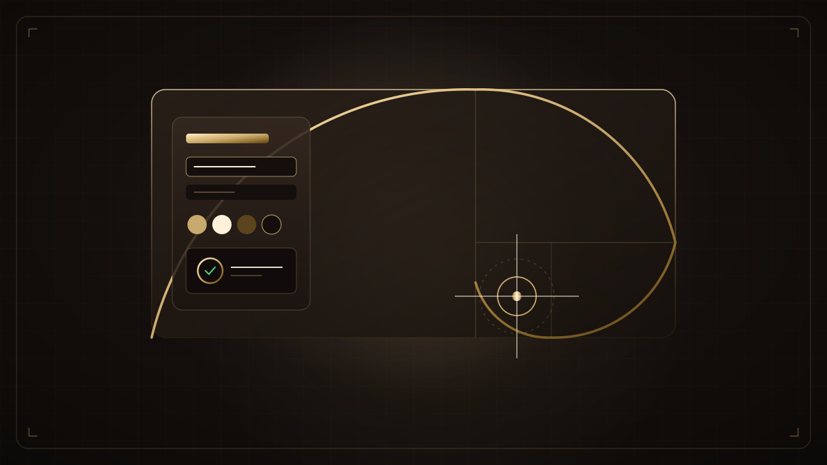
If visitors cannot locate what they need within two clicks, they leave your website and visit a competitor. Intuitive navigation is the bedrock of digital usability.
1. The Rule of 7 Main Menu Items
Psychological research confirms that human working memory holds roughly 7 items at once. Cap your primary navbar links at 5–7 top-level categories.
2. Sticky Glassmorphism Header
A subtle sticky header allows users to navigate instantly from any scroll depth without having to scroll all the way back to the top of long landing pages.
Kapil Wadhwa
AuthorLead Market Research & Brand Intelligence Strategist
Specializing in commercial market research, consumer brand perception, digital intelligence, and enterprise competitive positioning.
Need architecture direction for your brand?
Connect directly with Vipin Wadhwa, Kapil Wadhwa, and our team to review your technical brief within 24 hours.
Related Insights in Website Strategy
Web Accessibility (WCAG 2.1): Why It Matters for SEO, UX, and Compliance
Implement inclusive design practices: color contrast ratios, ARIA landmark roles, and full keyboard navigation for universal accessibility.
Custom Code (Next.js/React) vs SaaS Builders (Wix/Shopify): When to Upgrade
Understand the tipping point where closed SaaS builders limit your growth and when to transition to bespoke Next.js architecture.
How to Connect Your Website Lead Forms to CRM and WhatsApp Automations
Eliminate manual lead logging with webhook integrations that route website brief submissions directly to CRM pipelines and WhatsApp.